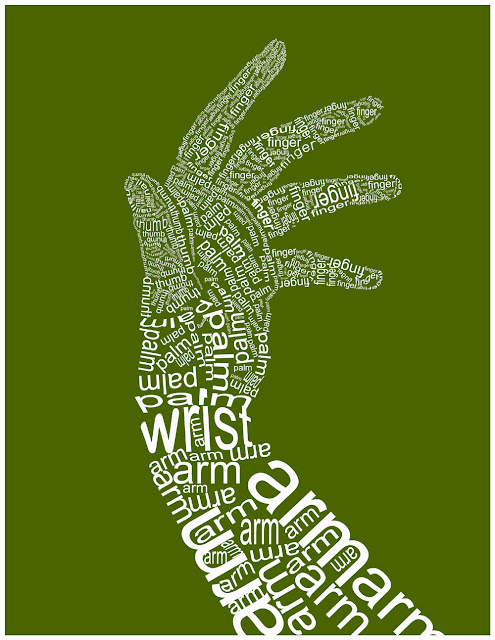
What I liked about this piece was that they went from larger to smaller, which I think works in this. They also just used words related, which were arm wrist palm, finger, and other such words, which I think adds to the piece. I don't know the purpose but I think it really works because they use what looks like the same font and just variations of it. Sizing, thickness, and brightness of color were used to add emphasism in certain places and I think makes the piece look really cool.
If they did an entire body like this I think it would really look awesome, but I like it. The huge font though throws me off because there is so much white at the bottom and it doesn't look like there is any on the top, so that throws me off a little bit. There are also some spacing issues in the palm and in some fingers that looks weird, like they just couldn't fit all the pieces to the puzzle correctly. Also at the bottom of the page where the font is huge, they have some weird spacing there as well.

No comments:
Post a Comment