Four principles of typography
- Repetition – not having too many differences. Use certain tracking, colors, types throughout the entire piece
- Contrast – Having small differences to make contrast and make the piece interesting. Contrast in color, tracking, type
- Proximity – How close text is to design elements. How close text is to the edge of the paper
- Alignment – Justification, how you align your text, objects, and any piece in your piece.
Font Metrics (Font anatomy)
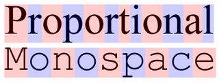
Proportional and Monospace


No comments:
Post a Comment