 The Color Wheel
The color wheel shows the traditional basic colors that is
fundamental to all artists. The color wheel shows the basic colors that all
other colors are made out of. A basic color wheel has primary, secondary, and
tertiary colors.

As you can see above, primary colors are Red, Blue, and
Yellow. These are the main three colors in art of which out of these all other
colors are created. Secondary colors are Green, Orange and Purple. Secondary
colors are formed by mixing combinations of the three primary colors. Tertiary
colors are formed by mixing primary and secondary colors together, forming
colors such as Yellow-Orange, Red-Orange, Red-Purple, Blue-Purple, Blue-Green,
and Yellow-Green.

 Complementary colors are any
two colors that are directly opposite from one another in the color wheel, such
as Red and Green, Red-Purple and Yellow-Green. These colors create maximum
contrast between objects and colors.
Complementary colors are any
two colors that are directly opposite from one another in the color wheel, such
as Red and Green, Red-Purple and Yellow-Green. These colors create maximum
contrast between objects and colors.
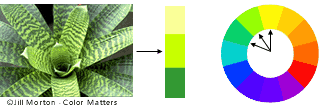
 Nature provides perfect
harmony in itself, so using colors that can be found in nature can be used for
designs. In the example below, green, red and yellow create a harmonious design
even though it doesn’t fit into the technical formula for color harmony.
Nature provides perfect
harmony in itself, so using colors that can be found in nature can be used for
designs. In the example below, green, red and yellow create a harmonious design
even though it doesn’t fit into the technical formula for color harmony.
 Color Harmony
Harmony is defined as a
pleasing arrangement of parts, whether its music, poetry and color. It creates
an inner sense of order, and a balance in the visual experience. It can be hard
to make something harmonious, because if its too bland, its boring and yet if
its too overdone, then its chaotic and confuses the viewer. There are several
theories about different formulas to find a harmonious match of colors.
Analogous Color
Scheme
The first theory is a color
scheme that is based on analogous colors. Analogous colors are three colors
which are side by side on the 12 part color wheel, such as yellow-green,
yellow-orange, and yellow.
Complementary
Color Scheme
 Complementary colors are any
two colors that are directly opposite from one another in the color wheel, such
as Red and Green, Red-Purple and Yellow-Green. These colors create maximum
contrast between objects and colors.
Complementary colors are any
two colors that are directly opposite from one another in the color wheel, such
as Red and Green, Red-Purple and Yellow-Green. These colors create maximum
contrast between objects and colors.
Nature Color
Scheme
 Nature provides perfect
harmony in itself, so using colors that can be found in nature can be used for
designs. In the example below, green, red and yellow create a harmonious design
even though it doesn’t fit into the technical formula for color harmony.
Nature provides perfect
harmony in itself, so using colors that can be found in nature can be used for
designs. In the example below, green, red and yellow create a harmonious design
even though it doesn’t fit into the technical formula for color harmony. Color Context
Colors look different when paired with certain colors. In
the example below, it shows how differently the same red block looks when
against different colored squares.

When looking at the red square with the black background
compared to the red square with the orange background, it looks completely
different. With the black background, the red square looks more brilliant,
compared to the white square which makes it look more dull. With the orange
background, the color appears lifeless, but with the blue background, it looks
brilliant. Also the black background makes the red square look larger than any
other background color.
This shows how the appearance of colors changes depending on
what background it is on and what colors are also used in the design. When colors are overlapped with varying shades
of the same color, it makes the color on top look like a different shade when
in reality it is the same color. Looking at the affects that colors have on one
another is the beginning point of understanding relativity of color. The
relationship of values, saturation's and the warmth or coolness of respective
hues can cause a noticeable difference in the way that people perceive that
color.
NOTE:
Information and graphics on this page are taken from Color Matters, Basic Color Theory at http://www.colormatters.com/color-and-design/basic-color-theory.
No comments:
Post a Comment